Brand Name
Inovelli is a mixture of the word, "Innovation" and "Novelli" (derived from the Latin word, "novellus", which means "new"). It speaks to the fact that we embrace the challenge of innovation by always pushing boundaries to launch products that inspire and elevate and are new to the entire market.
Said another way, we're not here to make the boring, cookie-cutter smart home products; we're here to redefine what smart home products are.

Brand Logo
Our logo’s sleek, minimalist design captures the essence of kinetic motion, symbolizing the dynamic energy and forward momentum of our technology. You'll notice the spacing increases between the letters as you move left to right, which symbolizes the energy accelerating throughout the logo. This represents our commitment to innovation and constant evolution.
To us, it’s not just a logo; it’s a visual representation of the cutting-edge technology and our ever-growing community of smart home owners that build our products.

Brand Icon
Our icon is more than just a symbol—it’s the heartbeat of our identity. It captures and communicates our core values and personality in a single, striking image and embodies the essence of what we stand for.
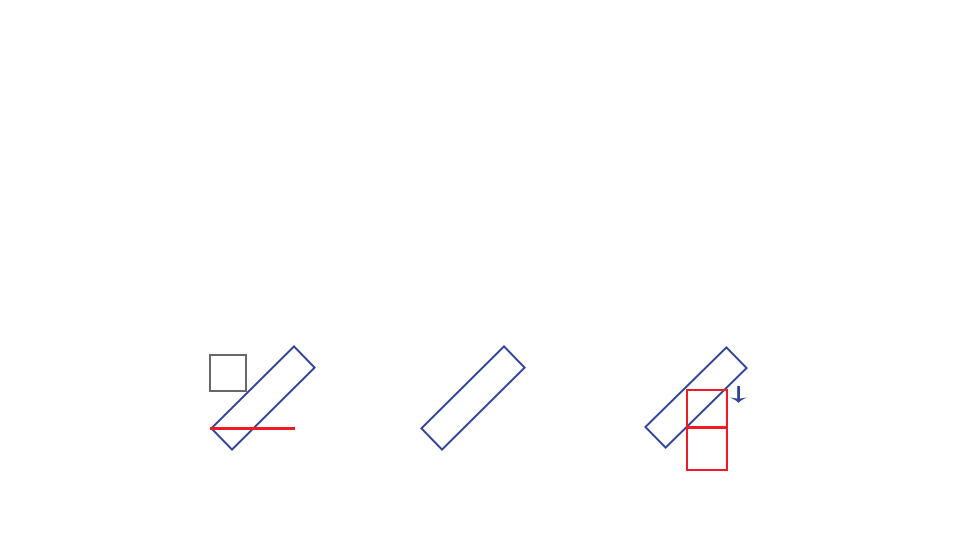
A. The overall icon is a planet (grey) orbiting the horizon (red), with the LED light beam (blue) in the middle and a reflection of the beam on the ground. Its meant to be a futuristic hieroglyphic found in space of the technology we use in our products.
B. The parallelogram represents our distinctive LED Bar (blue) and is shooting down from the sky as represented in our artwork.
C. Picture two things here: The outline of a light switch paddle (red) and a relay inside the switch turning on and off (blue).
Inovelli artwork
Our artwork reflects the essence of our brand — bold, futuristic, and always pushing boundaries. Each scene portrays explorers journeying through uncharted worlds, guided by radiant beams that symbolize our signature LED bars and our commitment to innovation. Like these travelers, we venture beyond the ordinary to create cutting-edge smart home solutions that are lightyears ahead. Welcome to the future of smart living, designed to illuminate, inspire, and perform.


